Get mobile or get out: Google’s make or break update explained
There’s nothing like a Google update to shake the fruit from the tree. Only this isn’t an update like we’ve seen before. As of 5th July 2024, Google has completed its transition to mobile-first indexing. This is a huge shift in the way Google indexes websites it's a turning point that underscores the critical importance of mobile accessibility in web design.
This means if your website design isn’t mobile-friendly, now is the time to act. In this blog, we'll explain what Google’s mobile-first indexing means for you, why it’s critical to your online visibility, and how a mobile-friendly website redesign is key to future-proofing your digital presence.
What is mobile-first indexing?
Launched back in 2016, Google's mobile-first indexing initiative was designed to prioritise the mobile version of a website design when determining its ranking in search engine results. The idea was simple: with more and more users accessing the internet through mobile devices, Google wanted to ensure that the websites they were visiting were optimised for these users.
Initially, both the desktop and mobile versions of a website design were crawled, but the mobile version given priority when it came to indexing. Fast forward to 2024, and Google is taking this a step further—since July 5th, only the mobile version of your site is indexed.
Key points of mobile-first indexing
1. Responsive website design is crucial
If your website isn’t accessible on mobile devices, it’s essentially invisible to Google—and, by extension, to potential customers. A mobile-friendly website is no longer optional; it’s essential for maintaining organic search visibility. Your desktop version alone won’t cut it unless it functions seamlessly on mobile devices.

2. Desktop version can still work—with conditions
If your website currently uses a desktop-only template, don’t panic. It’s still possible for your site to be indexed if, and it’s a huge if, the desktop version works perfectly on mobile devices.
However, this isn’t an ideal situation. Users expect a smooth, tailored experience when browsing on their phones or tablets. If your site doesn’t meet these expectations, you’re likely to see higher bounce rates and lower conversion rates, even if you do manage to stay indexed.
3. Limited desktop crawling
Google may still use its desktop crawler for specific types of content, such as product listings or job postings, but don’t rely on this as a loophole. Your website’s content must be mobile-optimized to maintain visibility.
What happens if my website design is not optimised for mobile?
Ignoring mobile-first indexing can have severe consequences. Google uses its mobile user agent to view and index your content. If any of your content is only accessible on desktop, it won’t be indexed at all. Worse, if there are issues with crawling or rendering your site on mobile, it can lead to significant indexation problems. Pages with crawlability issues on mobile are unlikely to be indexed by Google, which will severely impact how your site is ranked.
Since 5th July 2024, websites that don’t pass the mobile test risk disappearing from Google’s search results, resulting in a dramatic drop in organic traffic. For businesses that depend on online visibility to attract customers and generate leads, this could be terminal.
Be warned: failing to optimize your site for mobile with a responsive website design means your site may no longer appear in Google’s search results. Mobile devices dominate the digital landscape with over 60% of all web traffic now coming from them. Businesses need to adapt or risk becoming obsolete. The sooner you can future-proof your business, the better.

What can I do if I don’t have a responsive website design?
Ensuring your website is mobile-friendly is not just about staying visible in Google’s search results—it’s about staying competitive in an increasingly mobile world. If you do not address the issues caused from this update, your competitors will have. You cannot afford to not be online.
1. Test and review the website design for mobile accessibility
The first step is to test your website’s mobile accessibility. Google Search Console offers a URL Inspection tool that shows you how your site appears on mobile devices. If you notice any issues—whether it’s slow loading times, poor formatting, or unresponsive design—it’s time to take action.
2. Make your website responsive
Overcoming the issues identified during the test and review stage need to be your top priority. This involves more than just shrinking your desktop site to fit smaller screens, a responsive design adjusts seamlessly to any screen size which not only resolves the mobile-first indexing challenges, but potentially protects from future accessibility changes too. A truly mobile-friendly website is designed with user experience in mind, featuring easy navigation, and fast loading times.
3. Optimise for SEO
A mobile-friendly design doesn’t just improve the user experience; it also boosts its search engine rankings. By optimising your site for mobile, you’re sending a strong signal to Google that your content is relevant and accessible to a wide audience. This commitment to SEO results in higher rankings, more traffic, and ultimately, more conversions.
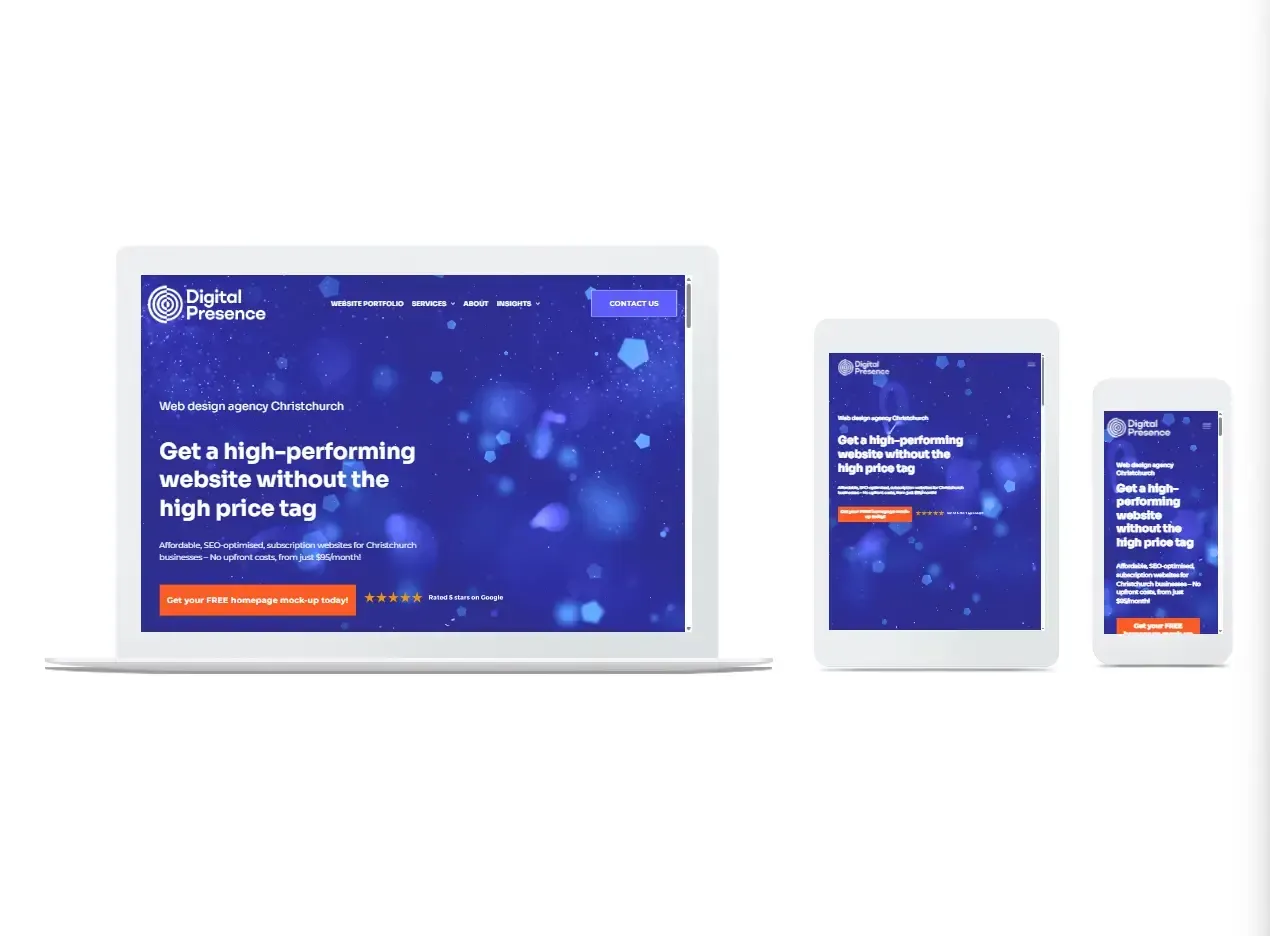
How Digital Presence reinvigorates websites
Your website is often the first point of contact between your business and potential customers, so when it comes to making critical design changes, there’s no room for error. If you lack the time or confidence in your web design and development skills, it’s time to call in the professionals.
As a leading digital agency in Christchurch, Digital Presence specializes in creating responsive websites that deliver on all fronts. Mobile responsiveness is just one aspect of our user experience-focused web design approach. Whether your goal is to attract more visitors, increase conversions, or boost your search engine rankings, our expertise will help you succeed. We focus on designs that are not only visually appealing but also highly functional, with fast load times and intuitive navigation; websites that perform seamlessly—on any device.
The time to act is now
Don’t wait until it’s too late. Contact Digital Presence in Christchurch NZ today to discuss your options for a new website design. Our team of experts is ready to help you navigate this transition and ensure your site is ready for the future. Let’s make sure your business stays ahead of the curve—because when it comes to your online presence, there’s no room for compromise.
Share