What does responsive web design mean? And why do I need it?
In the world of web design, the term "responsive web design" is frequently used, but its full meaning and significance are often not fully understood by small to medium business owners. Responsive web design, also known as a "mobile-friendly website," is far from simplistic. It offers a plethora of benefits that can significantly enhance your business's online presence and overall success.
What is Responsive Web Design?
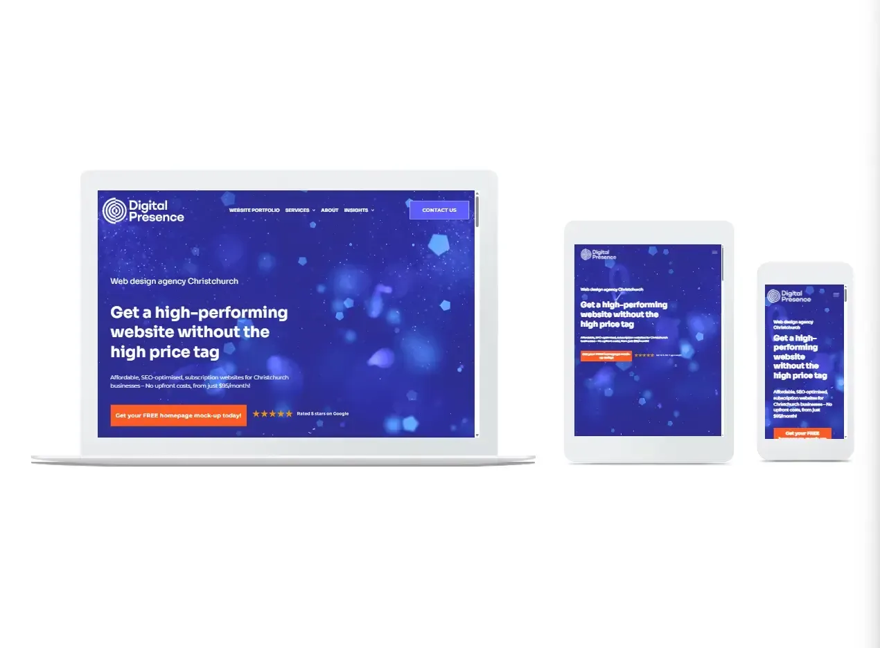
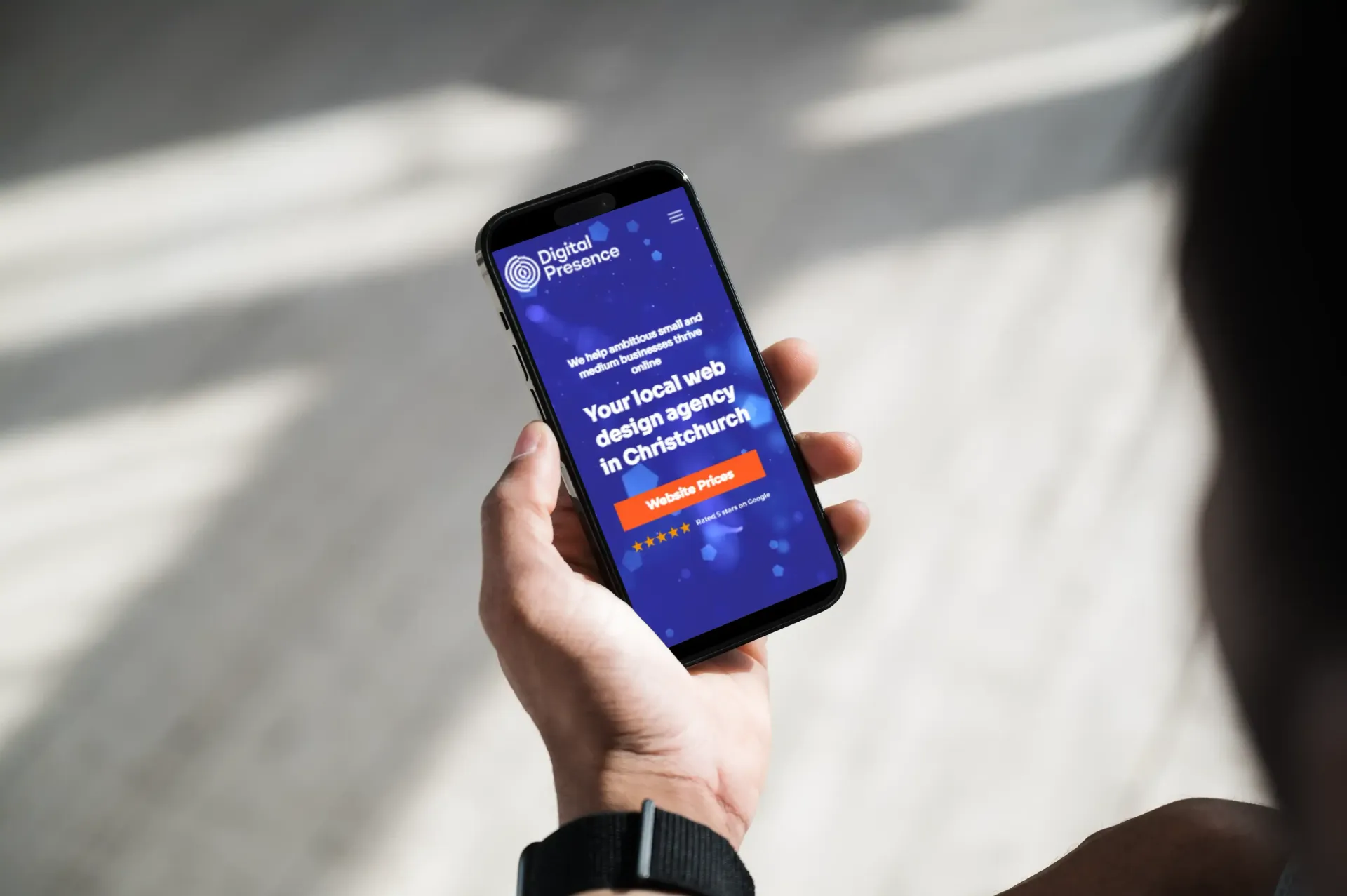
Responsive web design is a web development approach that ensures a website adapts seamlessly to the screen size of any device being used, without requiring any manual intervention from the user. This means that whether someone is viewing your website on an iPhone, desktop, or even a large home cinema screen, they will experience consistent design, functionality, and usability. The core principle behind responsive web design is to provide an optimal viewing experience—easy reading and navigation with minimal resizing, panning, and scrolling—across a wide range of devices.
Why Do I Need a Responsive Web Design for My Business?
Google Loves Responsive Websites
Google’s primary function is to provide searchers with relevant and high-quality information as quickly as possible. To achieve this, Google favors websites that are optimized to deliver a superior user experience, and responsive web design is high on Google’s SEO wish list. Here’s why:
- Mobile-First Indexing: Google now primarily uses the mobile version of the content for indexing and ranking. If your website is not mobile-friendly, it might not rank well in search results.
- Faster Loading Times: Responsive web design often leads to faster loading times on mobile devices, which is a critical factor for Google’s ranking algorithm.
- Lower Bounce Rates: A responsive website ensures that visitors have a smooth and pleasant experience, which reduces the likelihood of them leaving immediately (bouncing) after arriving on your site. Lower bounce rates are another factor that Google considers when ranking websites.
When your website ticks SEO boxes by being fast-loading, accessible on any device, and consistently delivering quality engaging content, Google rewards you by ranking your website higher on the search engine results page, sending more traffic your way. Simply put, Google loves websites optimised for success, and responsive web design is a key component of that optimization.
A Responsive Web Design Makes Your Customers Happy
A responsive website provides an enjoyable and seamless experience for users, which is crucial for turning visitors into returning customers. Here’s how:
- Consistent Branding: Users recognize your brand across all devices, which builds trust and familiarity.
- Ease of Navigation: A responsive design ensures that users can easily find the information or products they are looking for, regardless of the device they are using.
- Effortless Checkout: For e-commerce sites, a responsive design simplifies the checkout process, reducing cart abandonment and increasing conversions.
To achieve these benefits, the best website designs seamlessly link the user interface (UI) and user experience (UX) across different devices and platforms.
What is UI?
UI, or user interface, refers to the visual elements of a website that users interact with. This includes typography, colors, buttons, icons, imagery, and spacing. The goal of UI design is to use the brand’s visual assets to create a consistent, coherent, and appealing extension of the business. An effective UI design makes a website intuitive and engaging, encouraging users to stay longer and explore more.
What is UX?
UX, or user experience, goes beyond the visual elements to encompass the overall interactions between the user and the company. UX design focuses on how users feel when they interact with your website. Key aspects of UX include:
- Ease of Navigation: Can users easily find what they are looking for?
- Efficiency: Can users complete tasks (like making a purchase) quickly and without frustration?
- Relevance: Does the website provide valuable and relevant content to the user?
Good UX design ensures that users have a positive and efficient experience on your website, making them more likely to return.
A Responsive Website Design is Future-Proof
The days of designing a website solely for desktop are long gone. The rapid pace of technological innovation means that new devices and screen sizes are constantly being introduced. A responsive web design ensures that your website will look and function well on all current and future devices. This future-proof approach is crucial for staying ahead in the competitive digital landscape.
While investing in paid advertising, such as Google Ads, can drive immediate traffic to your site, SEO and organic search remain key components of long-term digital success. A responsive web design lays the foundation for effective SEO, helping your website to perform well in organic search results and supporting all your digital marketing efforts.
Responsive web design is not just a trend; it’s an essential strategy for any business looking to thrive online. By ensuring that your website provides a seamless and enjoyable experience on all devices, you can improve your SEO, delight your customers, and future-proof your digital presence.
If you want to learn more about responsive web design and how it can transform your online marketing, contact us today to arrange a no-obligation chat. Let’s work together to create a website that not only meets but exceeds your business goals.
Share